After discussing our summer plans- from study abroad programs to internships- and each of us was going to be in wonderful yet unfamiliar places.
We soon realized that the numerous apps or programs we had for safety weren’t women-centered unless it was for SOS buttons or other ‘last-resort’ resources. And, when we finally found useful information, it was merely safety precautions lacking details about the upside to various vacation spots.
So, we were inspired to create the best of both worlds with Venus Voyages- combining women’s safety measures with enjoyable trip recommendations and advice!
The Challenge
🧠
The Process
Creating the Visual Identity
Naming our company ‘Venus Voyages’ was a nod to the Roman goddess Venus who represents love and victory.
Therefore, I wanted to keep this natural aesthetic in an analogous color scheme to invoke harmony and comfort. So, I chose primary (3), secondary (3), and tertiary (2) brand colors from sunset images to guide our brand direction.
#7F3BBa
#DF7AAA
#FAE4A4
🗣️
Phase 02: Word Mapping
Before I could transfer over to Adobe Illustrator for the final logo, I created a word map to ground the icons.
Travel
Motion, suitcase, plane, horizon, motion lines, walking, city line.
Safety
Happy, shield, curves, rounded edges, circles
Adventure
Excited lines, organic, free flowing, excitement colors, swirls
🎯
Phase 03: Target Audience Personas
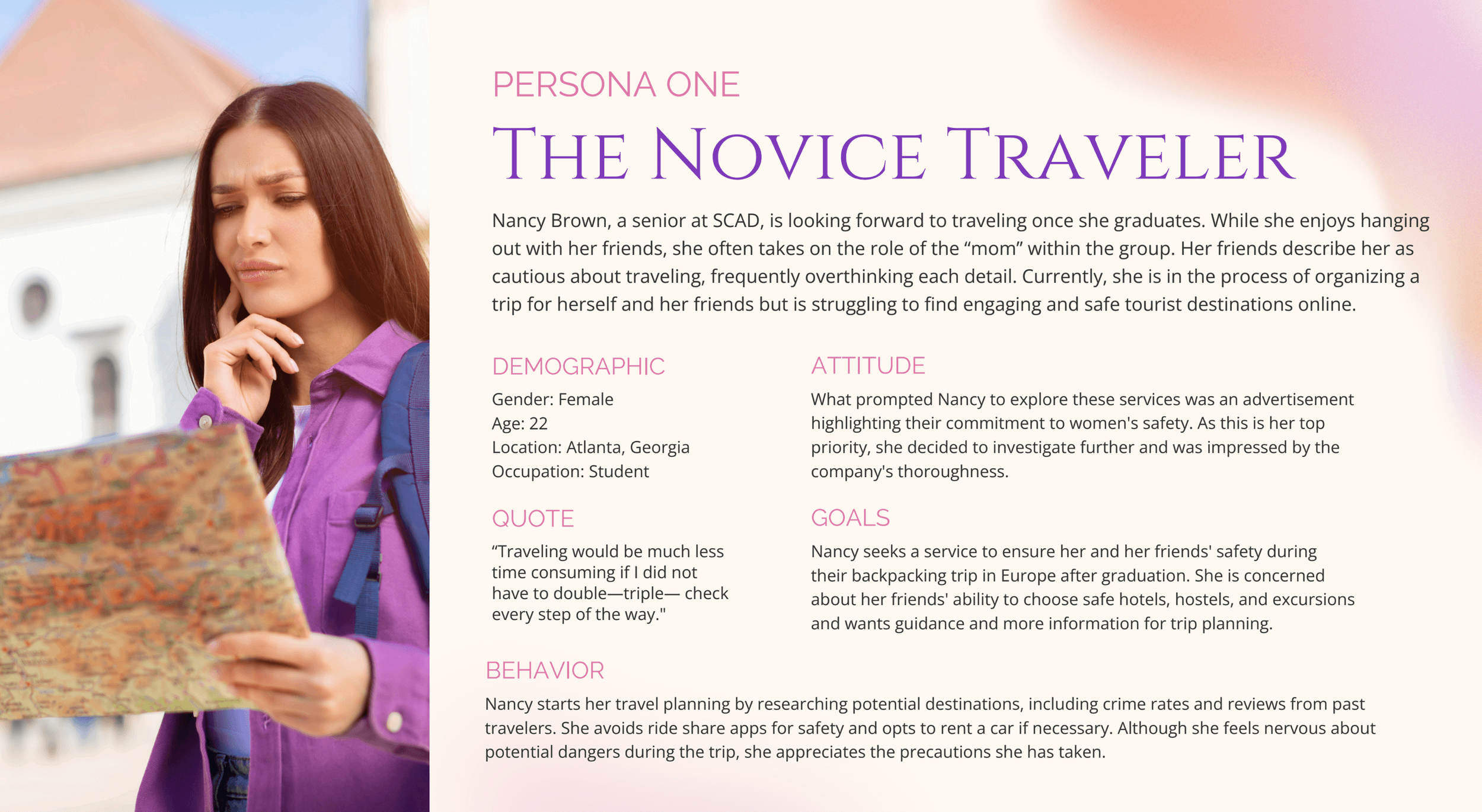
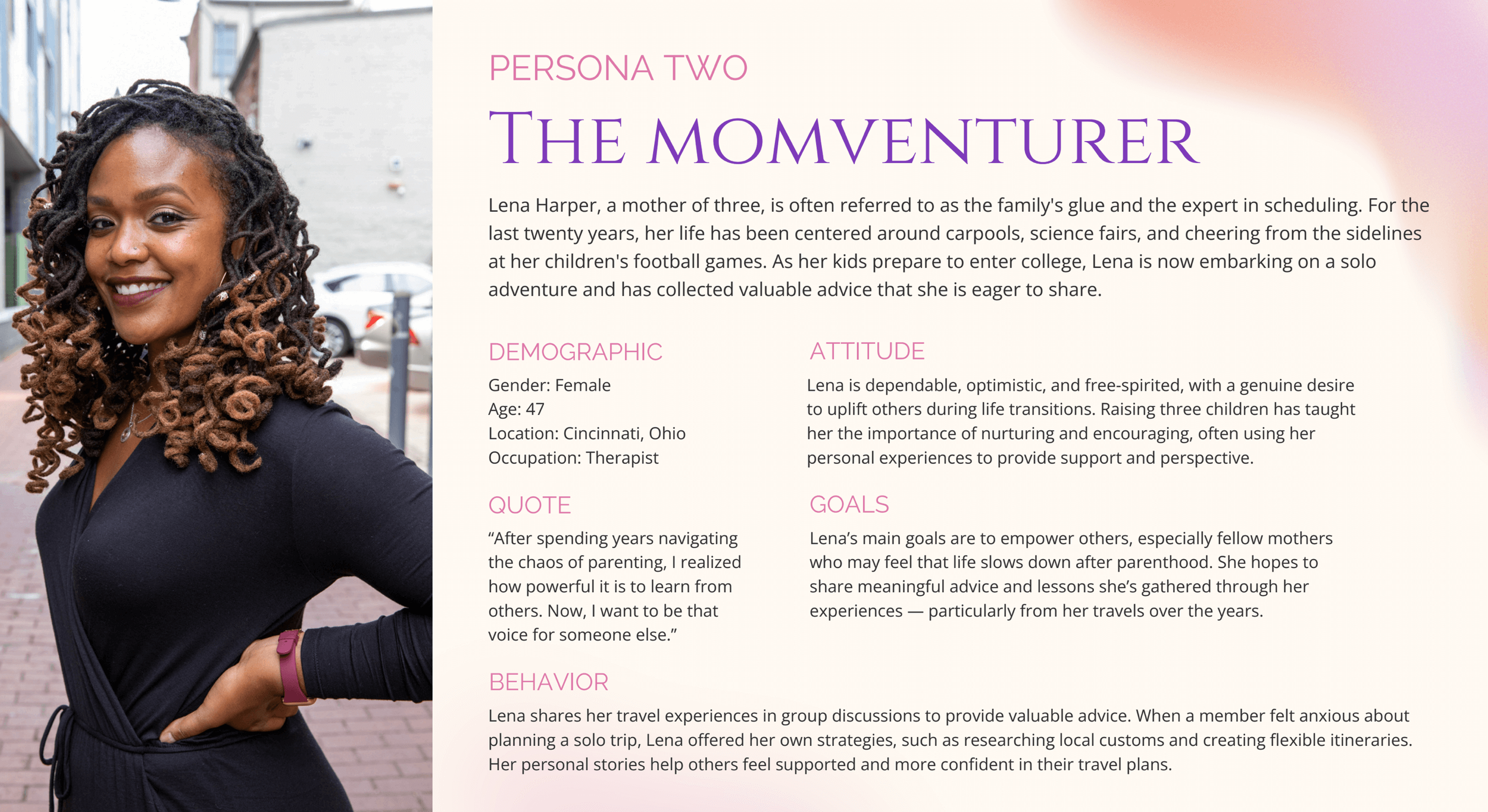
We then created two target personas of the Novice Traveler and the Momentum Traveler.
Ranging in traveling and preferences, our content needed to resonate with each type of woman.
🫧
Phase 04: Logo Creation
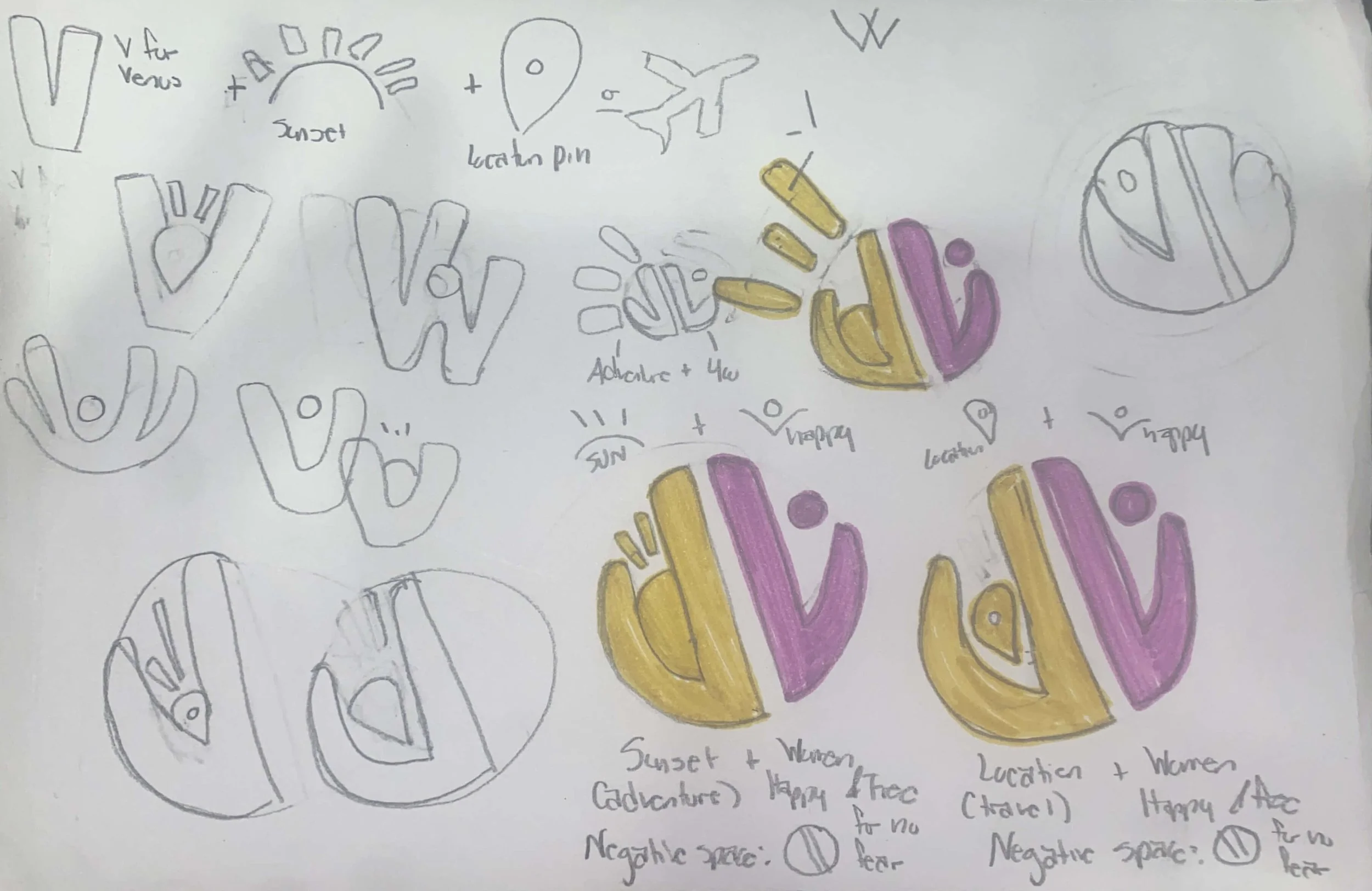
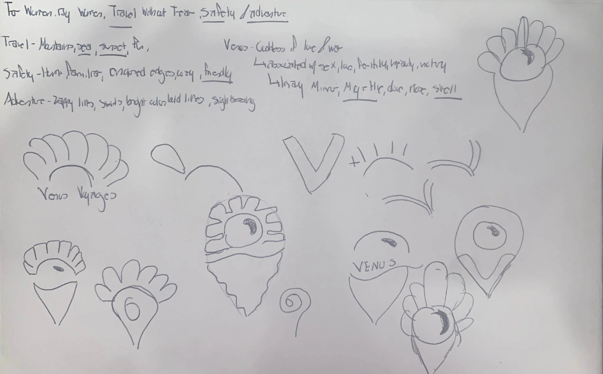
Next up was sketching logo ideas! This was, by far, the lengthiest part of the process as I took many initial directions.
Some ideations featured the two Vs (Venus Voyages) as the main motif with suns and location pins while others relied on oceanic symbols such as seashells.
🌎
📍
👩🏾🦱
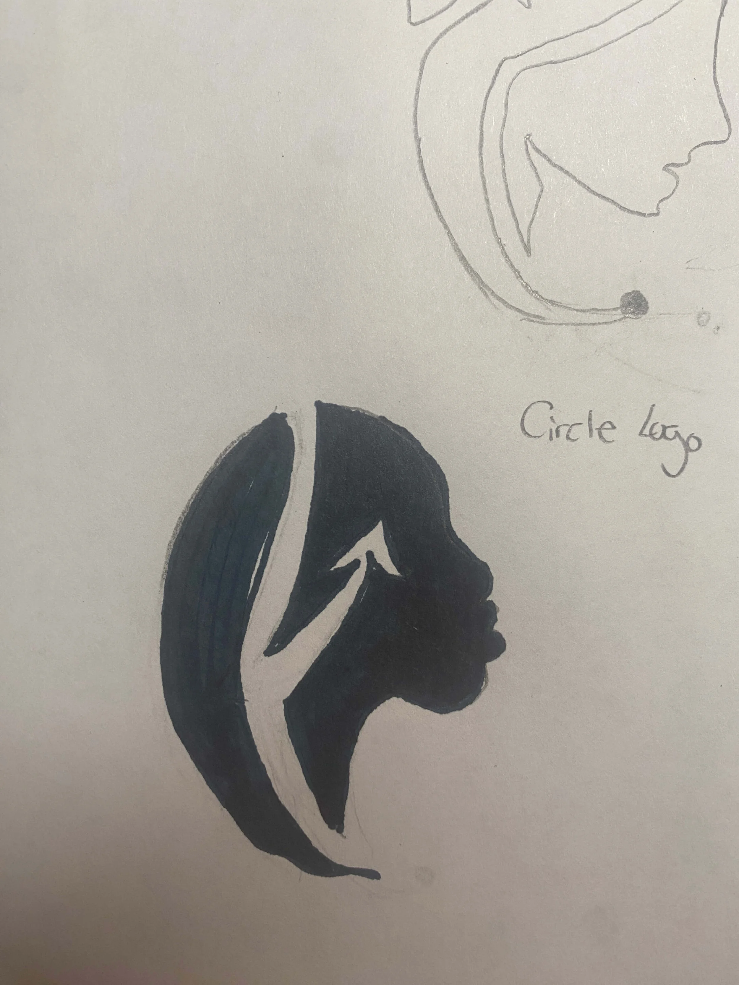
After further ideation sessions and feedback, I began to hone in on three symbols: a globe, a location pin, and a side profile of a woman’s face in a final round of sketches.
Globe
Our global mindset is represented by the overall circular shape which communicates how our women are the world — not just a part of it.
Location Pin
A location pin shows the safety we provide that empowers determined women with the support they need to navigate their journey.
Women’s Side Profile
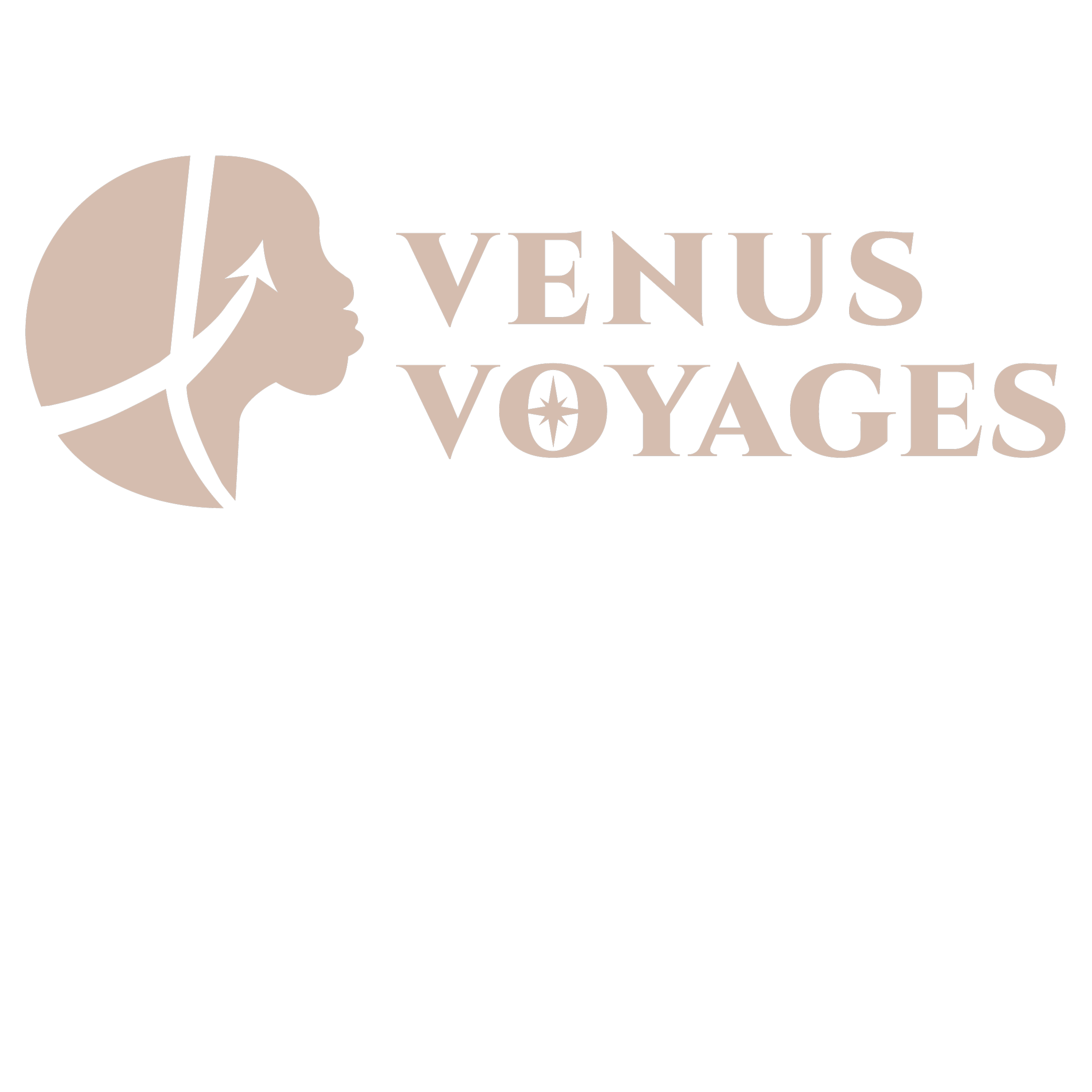
Instead of an eye, our Venus logo proudly sports an arrow: a symbol of travel and movement. Seeing the path of her travel through her hair exemplifies that where we have been is just as important as where we are going.
💾
Phase 05: Digitization, Icons, & Mockups
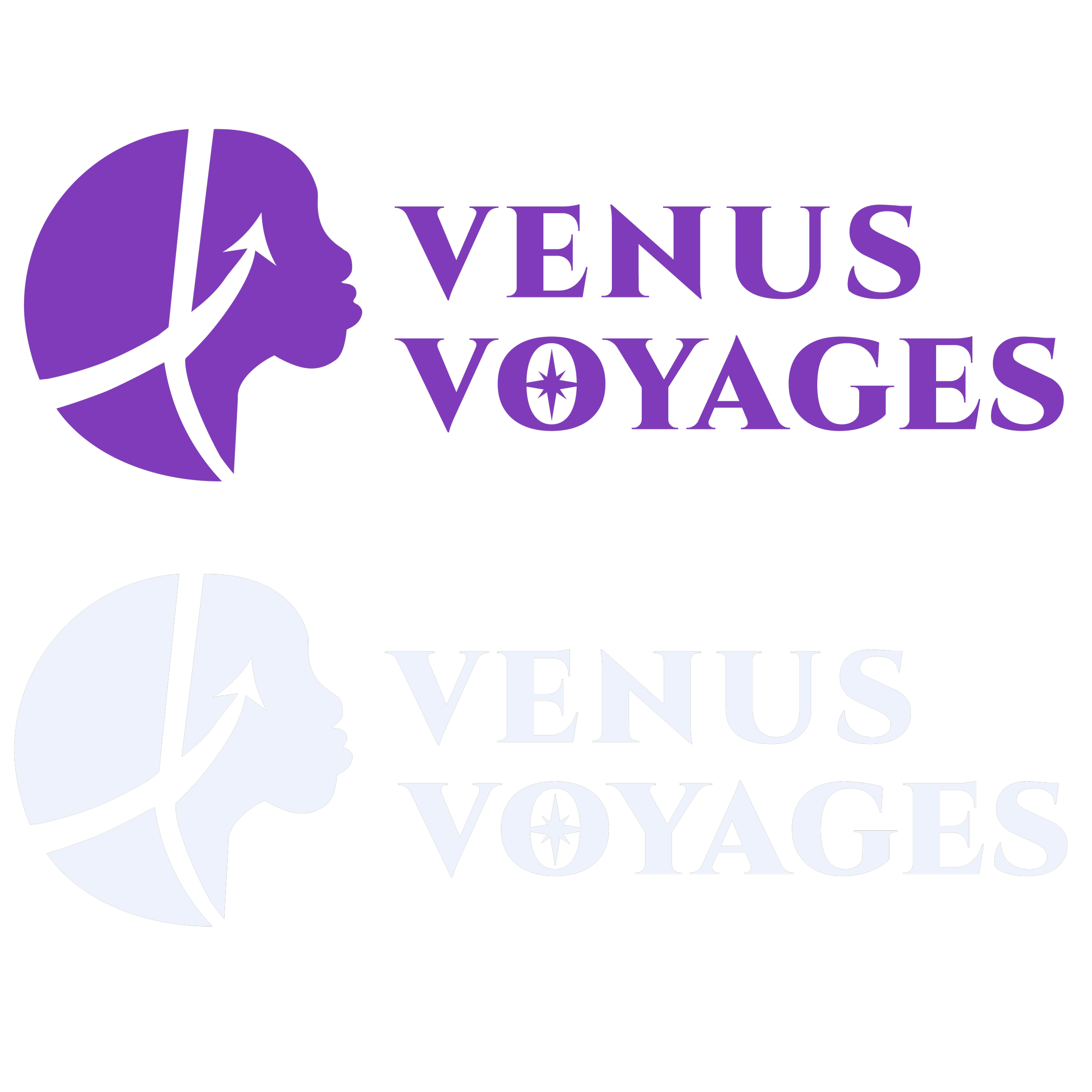
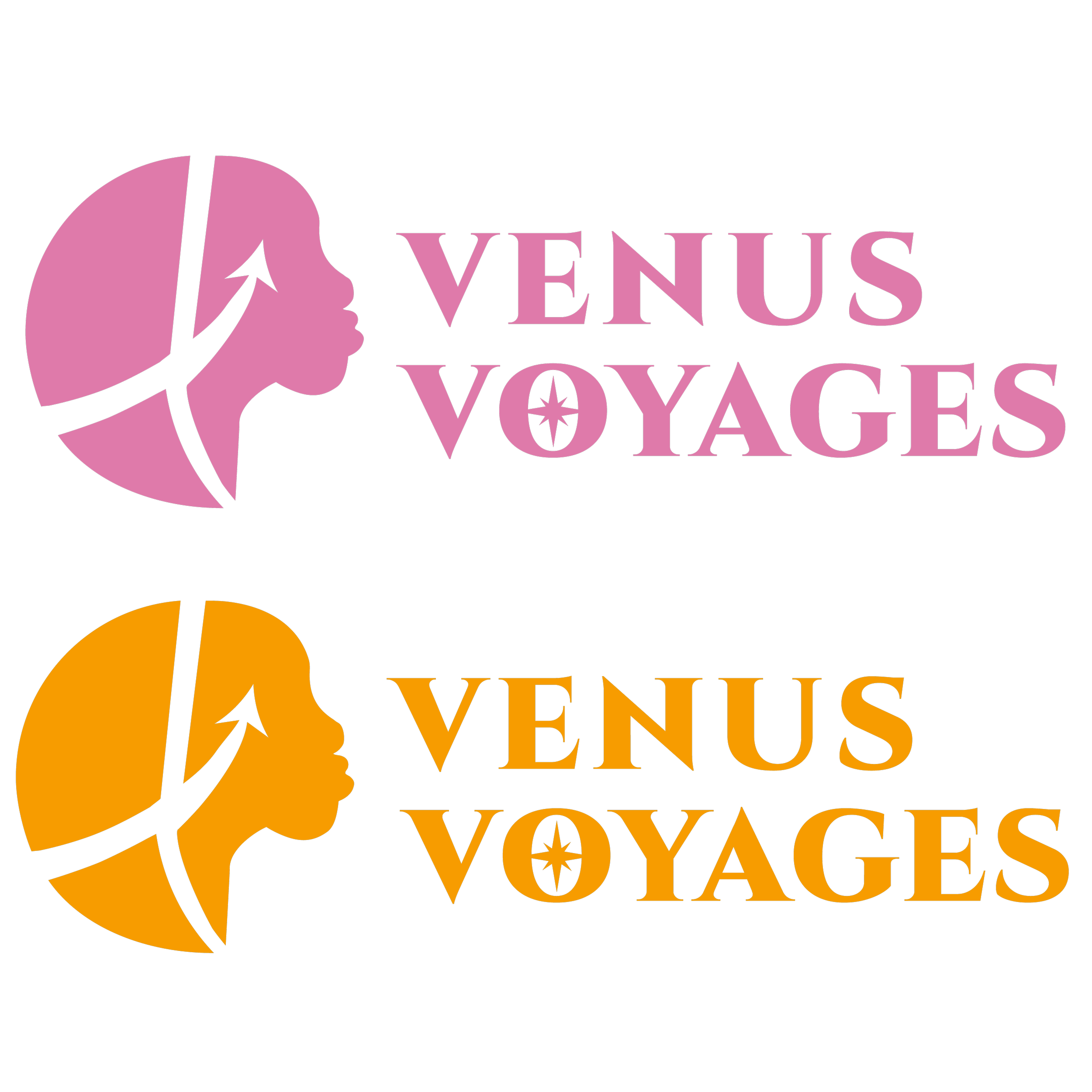
Soon, I transferred to Adobe Illustrator and created the final logo.
ᝰ.ᐟ
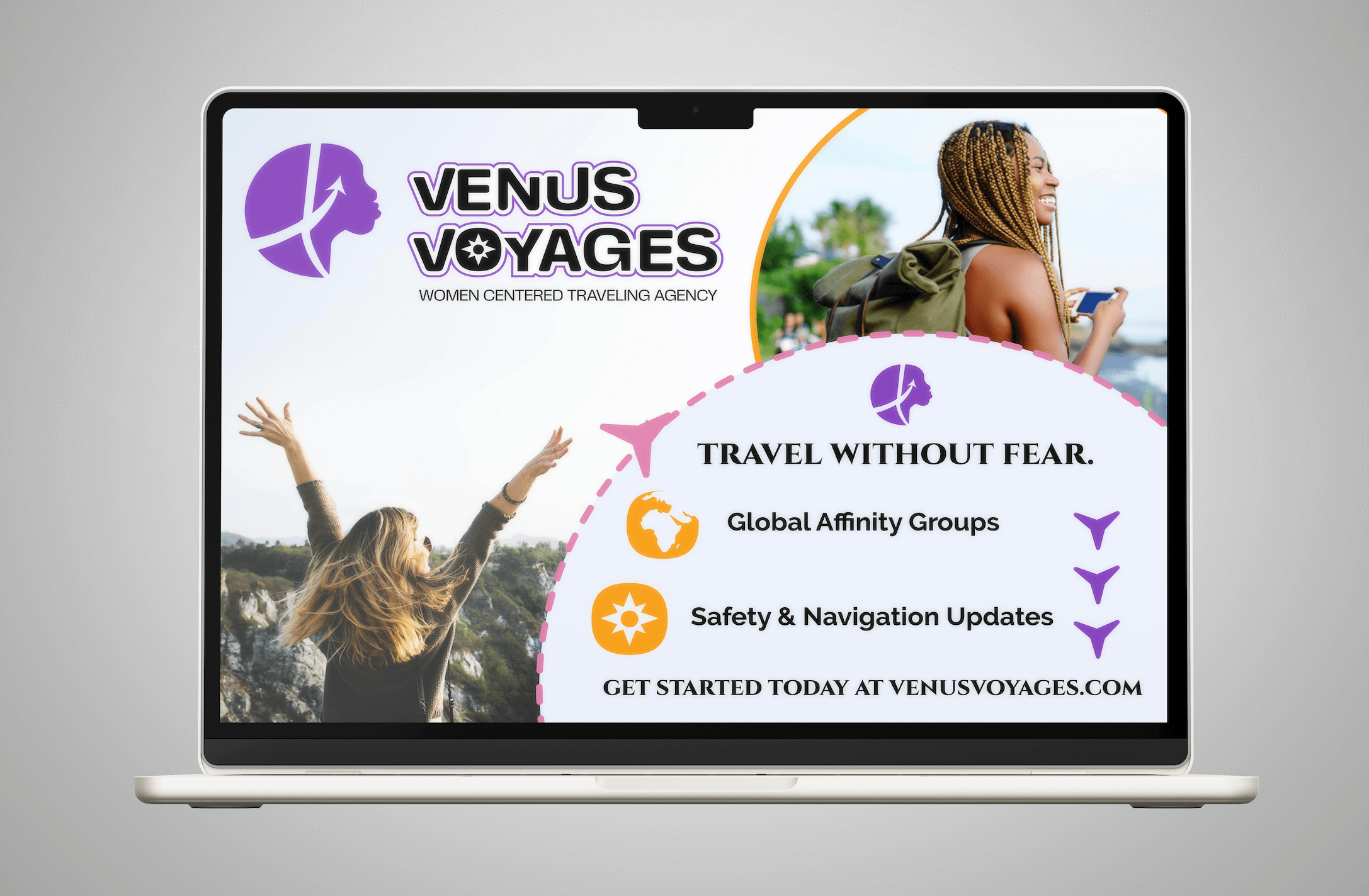
Bring in the Mock-Ups!
ᝰ.ᐟ Bring in the Mock-Ups!
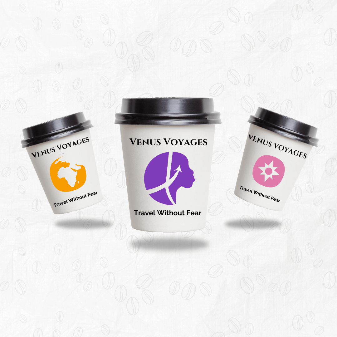
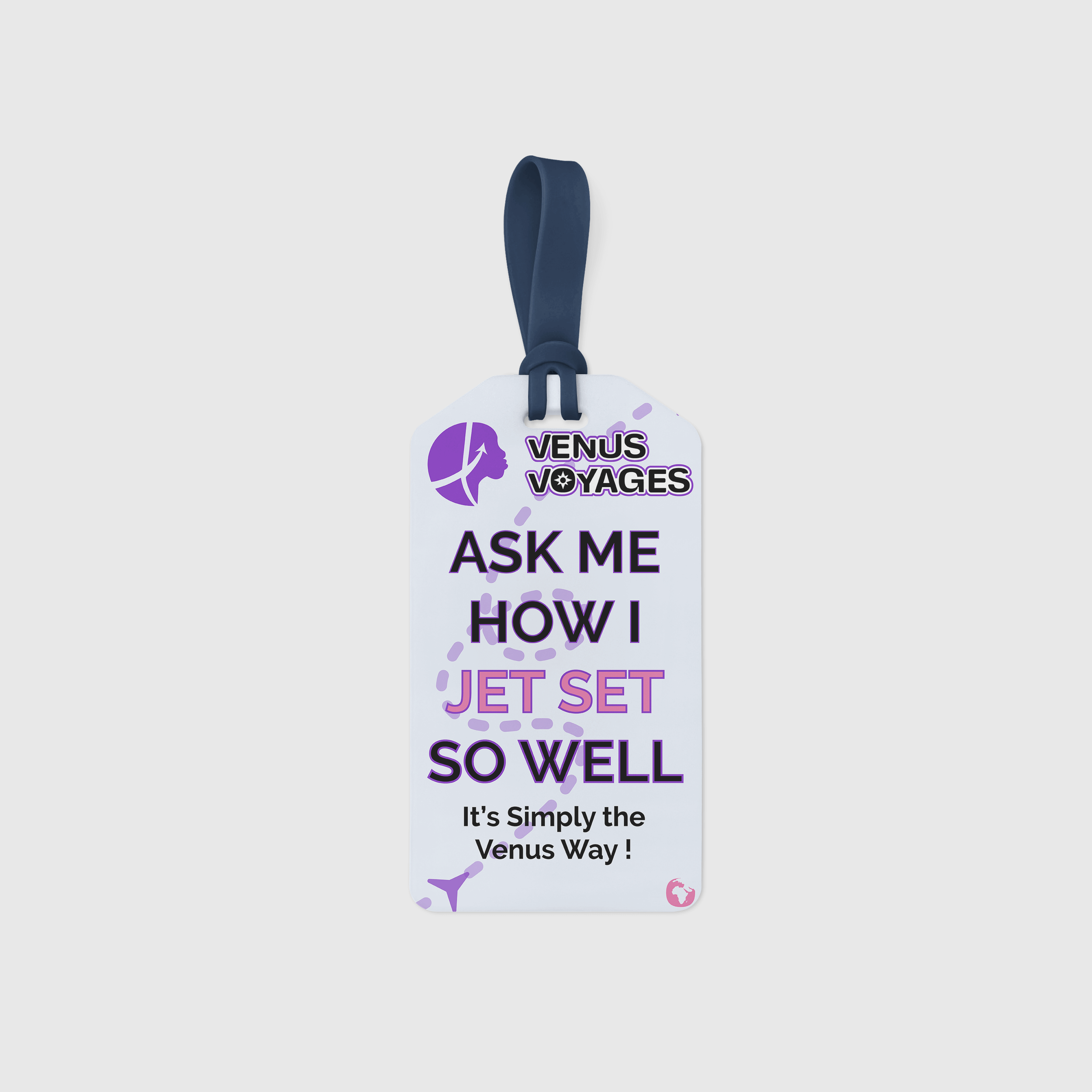
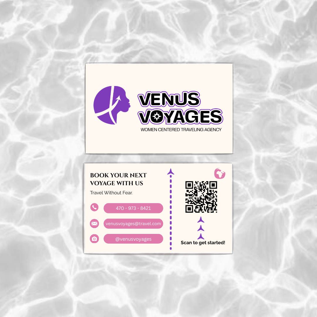
👩🏾💻
Phase 06: App Prototypes
The next phase of this project was to create a brand app and website prototypes in Figma.
I created the mobile app component as my teammates completed the website and other materials.
Being my first in-depth brand toolkit, I am pleased with how we brought Venus Voyages to life. I learned how to create iterations of iterations as the first option or visual component is not often the last.
It was also the first time I experimented with logo design so finding a rationale for every shape and component was an enlightening practice.
The Results
